Model Selection: Underfitting, Overfitting, and the Bias-Variance Tradeoff
In machine learning and pattern recognition, there are many ways (an infinite number, really) of solving any one problem. Thus it is important to have an objective criterion for assessing the accuracy of candidate approaches and for selecting the right model for a data set at hand. In this post we’ll discuss the concepts of under- and overfitting and how these phenomena are related to the statistical quantities bias and variance. Finally, we will discuss how these concepts can be applied to select a model that will accurately generalize to novel scenarios/data sets.
Models for Regression
When performing regression analyses we would like to characterize how the value of some dependent variable changes as some independent variable \(x\) is varied. For example, say we would like to characterize the firing rate of a neuron in visual cortex as we vary the orientation of a grating pattern presented to the eye. We assume that there is some true relationship function \(f(x)\) that maps the independent variable values (i.e. the angle of the grating pattern) onto the dependent variable values (i.e. firing rate). We would like to determine the form of the function \(f(x)\) from observations of independent-dependent value pairs (I may also refer to these as input-output pairs, as we can think of the function \(f(x)\) taking \(x\) as input and producing an output). However, in the real world, we don’t get to observe \(f(x)\) directly, but instead get noisy observations \(y\), where
\[y = f(x) + \epsilon \tag{1}\]Here we will assume that \(\epsilon\) is random variable distributed according to a zero-mean Gaussian with standard deviation \(\sigma_{\epsilon}^2\). Note that because \(\epsilon\) is a random variable, \(y\) is also a random variable (with a mean that is conditioned on both \(x\) and \(f(x)\), and exhibiting a variance \(\sigma_{\epsilon}^2\)).
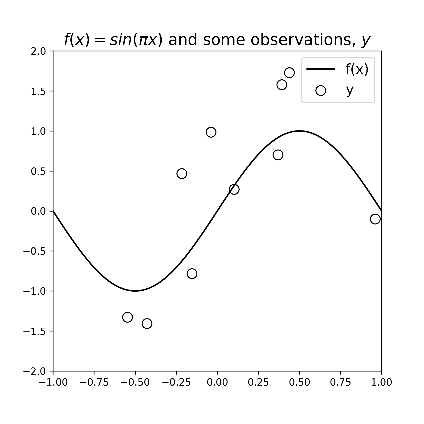
As an example, say that the true function \(f(x)\) we want to determine has the the following form (though we don’t know it):
\[f(x) = \sin(\pi x)\]Thus the observations \(y\) we get to see have the following distribution.
\[y = \sin(\pi x) + \mathcal N(0,\sigma_{\epsilon}^2)\]Below we define the function \(f(x)\) and display it, then draw a few observation samples \(y\), and display them as well:

Figure 1: A data-generating function \(f(x)\) and some noisy samples \(y\). The samples exibit a noise variance \(\sigma_{\epsilon}^2=1\)
Python Code
# Frontmatter
import numpy as np
np.random.seed(123)
MARKER_SIZE = 100
DATA_COLOR = 'black'
ERROR_COLOR = 'darkred'
POLYNOMIAL_FIT_COLORS = ['orange', 'royalblue', 'darkgreen']
LEGEND_FONTSIZE = 14
TITLE_FONTISIZE = 16
N_OBSERVATIONS = 10
NOISE_STD = 1.

x = 2 * (np.random.rand(N_OBSERVATIONS) - .5)
x_grid = np.linspace(-1, 1, 100)


def f(x):
    """Base function"""
    return np.sin(x * np.pi)


def sample_fx_data(shape, noise_std=NOISE_STD):
    return f(x) + np.random.randn(*shape) * noise_std


def plot_fx_data(y=None):
    """Plot f(x) and noisy samples"""
    y = y if y is not None else sample_fx_data(x.shape)
    fig, axs = plt.subplots(figsize=(6, 6))
    plt.plot(x_grid, f(x_grid), color=DATA_COLOR, label='f(x)')
    plt.scatter(x, y, s=MARKER_SIZE, edgecolor=DATA_COLOR, facecolors='none', label='y')


# Plot the data
y = sample_fx_data(x.shape)
plot_fx_data(y)
plt.legend(fontsize=14)
plt.title(f'$f(x) = sin(\pi x)$ and some observations, $y$', fontsize=16)
plt.xlim([-1, 1])
plt.ylim([-2, 2])
Our goal is to characterized the function \(f(x)\), but we don’t know the function form of \(f(x)\), we must instead estimate some other function \(g(x)\) that we believe will provide an accurate approximation to \(f(x)\). The function \(g(x)\) is called an estimator of \(f(x)\). In general, an estimator is some parameterized model that can capture a wide range of functional forms. One such class of estimators is the weighted combination of ordered polynomials:
\[g_D(x) = \theta_0 + \theta_1x + \theta_2x^2 + \dots \theta_D x^D\]As the polynomial order \(D\) increases, the functions \(g_D(x)\) are able to capture increasingly complex behavior. For example, \(g_0(x)\) desribes a horizontal line with an adjustable vertical offset \(\theta_0\), \(g_1(x)\) desribes a line with adjustable vertical offset and adjustable linear slope \(\theta_1\), \(g_2(x)\) describes a function that also includes a weight on the quadratic term \(\theta_2\). We thus try to fit the values of the parameters for a given estimator \(g_D(x)\) to best account for observed data in the hopes that we will also accurately approximate \(f(x)\).
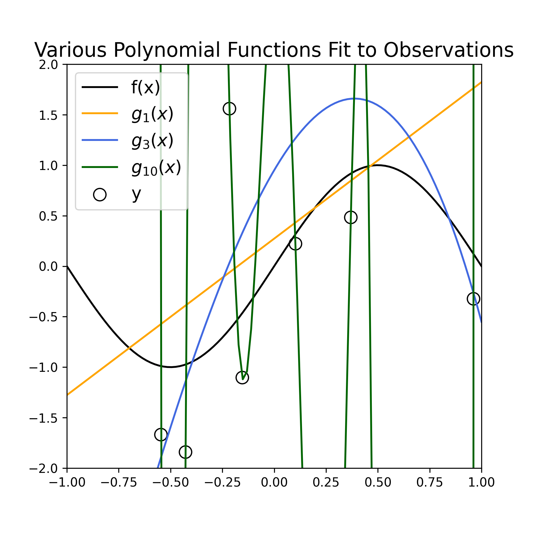
Below we estimate the parameters of three polynomial model functions of increasing complexity (using Numpy’s polyfit) to the sampled data displayed above. Specifically, we estimate the functions \(g_1(x)\), \(g_3(x)\), and \(g_{10}(x)\).

Figure 2: Fitting various polynomial estimators \(g_D(x)\) fit to noisy samples \(y\), for \(D = (1, 3, 10)\).
Python Code
plot_fx_data(y)

polynomial_degrees = [1, 3, 10]
theta = {}
fit = {}
for ii, degree in enumerate(polynomial_degrees):
    # Note: we should get an overconditioned warning for degree 10 because of extreme overfitting
    theta[degree] = np.polyfit(x, y, degree)
    fit[degree] = np.polyval(theta[degree], x_grid)
    plt.plot(x_grid, fit[degree], POLYNOMIAL_FIT_COLORS[ii], label=f"$g_(x)$")
plt.legend(fontsize=LEGEND_FONTSIZE)
plt.xlim([-1, 1])
plt.ylim([-2, 2])
plt.title("Various Polynomial Functions Fit to Observations", fontsize=TITLE_FONTISIZE)
Qualitatively, we see that the estimator \(g_1(x)\) (orange line) provides a poor fit to the observed data, as well as a poor approximation to the function \(f(x)\) (black curve). We see that the estimator \(g_{10}(x)\) (green curve) provides a very accurate fit to the data points, but varies wildly to do so, and therefore provides an inaccurate approximation of \(f(x)\). Finally, we see that the estimator \(g_3(x)\) (blue curve) provides a fairly good fit to the observed data, and a much better job at approximating \(f(x)\).
Our original goal was to approximate \(f(x)\), not the data points per se. Therefore \(g_3(x)\), at least qualitatively, provides a more desirable estimate of \(f(x)\) than the other two estimators. The fits for \(g_1(x)\) and \(g_{10}(x)\) are examples of “underfitting” and “overfitting” to the observed data, respectively:
- Underfitting occurs when an estimator \(g(x)\) is not flexible enough to capture the underlying trends in the observed data.
- Overfitting occurs when an estimator is too flexible, allowing it to capture illusory trends in the data. These illusory trends are often the result of the noise in the observations \(y\).
Bias and Variance of an Estimator
The model fits for \(g_D(x)\) discussed above were based on a single, randomly-sampled data set of observations \(y\). However, because \(\epsilon\) is a random variable, there are in principle a potentially infinite number of ranndom data sets that can be observed. In order to determine a good model of \(f(x)\), it would be helpful to have an idea of how an estimator will perform on any or all of these potential datasets. To get an idea of how each of the estimators discussed above performs in general we can repeat the model fitting procedure for many data sets.
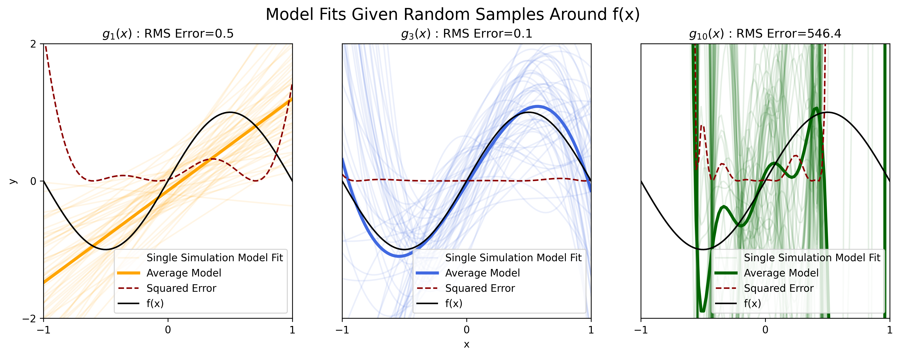
Here we perform such an analyses, sampling 50 independent data sets according to Equation 1, then fitting the parameters for the polynomial functions of model order \(D = (1,3,10)\) to each dataset.

Figure 3: Fitting various polynomial estimators \(g_D(x)\) fit to noisy samples \(y\), for \(D = (1, 3, 10)\).
Python Code
from collections import defaultdict

n_simulations = 50
simulation_fits = defaultdict(list)
for sim in range(n_simulations):
    # Start from same samples
    y_simulation = sample_fx_data(x.shape)
    for degree in polynomial_degrees:
        # Note: we should get an overconditioned warning
        # for degree 10 because of extreme overfitting
        theta_tmp = np.polyfit(x, y_simulation, degree)
        simulation_fits[degree].append(np.polyval(theta_tmp, x_grid))


def error_function(pred, actual):
    return (pred - actual) ** 2


fig, axs = plt.subplots(1, 3, figsize=(15, 5))
for ii, degree in enumerate(polynomial_degrees):
    plt.sca(axs[ii])
    for jj, fit in enumerate(simulation_fits[degree]):
        label = 'Single Simulation Model Fit' if jj == 0 else None
        plt.plot(x_grid, fit, color=POLYNOMIAL_FIT_COLORS[ii], alpha=.1, label=label)

    average_fit = np.array(simulation_fits[degree]).mean(0)
    squared_error = error_function(average_fit, f(x_grid))
    rms = np.sqrt(mean(squared_error))
    plt.plot(x_grid, average_fit, color=POLYNOMIAL_FIT_COLORS[ii], linewidth=3, label='Average Model')
    plt.plot(x_grid, squared_error, '--', color=ERROR_COLOR, label='Squared Error')
    plt.plot(x_grid, f(x_grid), color='black', label='f(x)')
    plt.yticks([])
    if ii == 1:
        plt.xlabel('x')
    elif ii == 0:
        plt.ylabel('y')
        plt.yticks([-2, 0, 2])

    plt.xlim([-1, 1])
    plt.ylim([-2, 2])
    plt.xticks([-1, 0, 1])
    plt.title(f"$g_(x)$ : RMS Error={np.round(rms, 1)}")
    plt.legend(loc='lower right')
plt.suptitle('Model Fits Given Random Samples Around f(x)', fontsize=TITLE_FONTISIZE)
The lightly-colored curves in each of the three plots above are an individual polynomial model fit to one of the 50 sampled data sets. The darkly-colored curve in each plot is the average over the 50 individual fits. The dark curve is the true, underlying function \(f(x)\).
Estimator Bias
We see that for the estimator \(g_1(x)\) (light orange curves), model fits do not vary too dramatically from data set to data set. Thus the averaged estimator fit over all the data sets (dark orange curve), formally written as \(\mathbb E[g(x)]\), is similar (in terms of slope and vertical offset) to each of the individual fits.
A commonly-used statistical metric that tries to assess the average accuracy of an estimator \(g(x)\) at approximating a target function \(f(x)\) is what is called the bias of the estimator. Formally defined as:
\[\text{bias} = \mathbb E[g(x)] - f(x)\]The bias describes how much the average estimator fit over many datasets \(\mathbb E[g(x)]\) deviates from the value of the actual underlying target function \(f(x)\).
We can see from the plot for \(g(x)_1\) that \(\mathbb E[g_1(x)]\) deviates significantly from \(f(x)\). Thus we can say that the estimator \(g_1(x)\) exhibits large bias when approximating the function \(f(x)\).
When averaging over the individual fits for the estimator \(g_3(x)\) (blue curves), we find that the average estimator \(\mathbb E[g_3(x)]\) (dark blue curve) accurately approximates the true function \(f(x)\), indicating that the estimator \(g_3(x)\) has low bias.
Estimator Variance
Another common statistical metric attempts to capture the average consistency of an estimator when fit to multiple datasets. This metric, referred to as the variance of the estimator is formally defined as
\[\text{variance} = \mathbb E[(g(x)-\mathbb E[g(x)])^2]\]The variance is the expected (i.e. average) squared difference between any single dataset-dependent estimate of \(g(x)\) and the average value of \(g(x)\) estimated over all datasets, \(\mathbb E[g(x)]\).
According to the definition of variance, we can say that the estimator \(g_1(x)\) exhibits low variance because the each individual \(g_1(x)\) is fairly similar across datasets.
Investigating the results for the estimator \(g_{10}(x)\) (green curves), we see that each individual model fit varies dramatically from one data set to another. Thus we can say that this estimator exhibits high variance.
We established earlier that the estimator \(g_3(x)\) provided a qualitatively better fit to the function \(f(x)\) than the other two polynomial estimators for a single dataset. It appears that this is also the case over many datasets. We also find that estimator \(g_3(x)\) exhibits low bias and low variance, whereas the other two, less-desirable estimators, have either high bias or high variance. Thus it would appear that having both low bias and low variance is a reasonable criterion for selecting an accurate model of \(f(x)\).
Included in each of the three plots in Figure 3 is a dashed red line representing the squared difference between the average estimator \(\mathbb E[g_D(x)]\) and the true function \(f(x)\). Calculating squared model errors is a common practice for quantifying the goodness of a model fit. If we were to calculate the expected value of each of the dashed red lines–assuming that all \(N\) values in an array of independent variables \(\mathbf x\) are equally likely to occur–we would obtain a single value for each estimator that is the mean squared error (MSE) between the expected estimator and the true function:
\[\mathbb E[(\mathbb E[g(\mathbf{x})]-f(\mathbf{x}))^2] = \frac{1}{N}\sum_{i=1}^N (\mathbb E[g(x_i)]-f(x_i))^2\]For the estimator \(g_3(x)\), the MSE will be very small, as the dashed black curve for this estimator is near zero for all values of \(\mathbf x\). The estimators \(g_1(x)\) and \(g_{10}(x)\) would have substantially larger MSE values. Now, because exhibiting both a low MSE, as well as having both low bias and variance are indicative of a good estimator, it would be reasonable to assume that squared model error is directly related to bias and variance. The next section provides some formal evidence for this notion.
Expected Prediction Error and the Bias-variance Tradeoff
For a given estimator \(g(x)\) fit to a data set of \(x\text{-}y\) pairs, we would like to know, given all the possible datasets out there, what is the expected prediction error we will observe for a new data point \(x^*\), \(y^*\) = \(f(x^*) + \epsilon\). If we define prediction error to be the squared difference in model prediction \(g(x^*)\) and observations \(y^*\), the expected prediction error is then:
\[\mathbb E[(g(x^*) - y^*)^2]\]If we expand this a little and use a few identities, something interesting happens:
\[\begin{align} \mathbb E[(g(x^*) - y^*)^2] &= \mathbb E[g(x^*)^2-2g(x^*)y^*+y^{*2}] \tag{2} \\ & = \mathbb E[g(x^*)^2] - 2\mathbb E[g(x^*)y^*] + \mathbb E[y^{*2}] \tag{3} \\ & = \mathbb E[(g(x^*) - \mathbb E[g(x^*)])^2] + \mathbb E[g(x^*)]^2 \\ & \;\;\;\;-2 \mathbb E[g(x^*)]f(x^*) \\ & \;\;\;\;+ \mathbb E[(y^*-f(x^*))^2] + f(x^*)^2 \tag{4} \end{align}\]where we have applied the following Lemma to the first and third terms of Equation 3, and use the fact to \(\mathbb E[y] = f(x)\) (Think of averaging over an infinite number of datasets sampled from y; all noise will average out, leaving \(f(x)\)). Rearranging Equation 4, we obtain:
\[\mathbb E[(g(x^*) - \mathbb E[g(x^*)])^2] + (\mathbb E[g(x^*)]^2 - 2 \mathbb E[g(x^*)]f(x^*) + f(x^*)^2) + \mathbb E[(y^*-f(x^*))^2] \tag{5}\]which can be further simplified by reversing a polynomial expansion and highlighting three terms
\[\color{green}{\mathbb E[(g(x^*) - \mathbb E[g(x^*)])^2]} + \color{blue}{( \mathbb E[g(x^*)]-f(x^*))^2} + \color{red}{\mathbb E[(y^*-f(x^*))^2]} \tag{6}\]- The first term is the variance of the estimator introduced above.
- The second term is the squared bias of the estimator, also introduced above.
- The third term is the variance of the observation noise and describes how much the observations \(y\) vary from the true function \(f(x)\). Notice that the noise term does not depend on the estimator \(g(x)\). This means that the noise term is a constant that places a lower bound on expected prediction error, and in particular is equal to the variance the noise term \(\sigma_{\epsilon}^2\).
Here we find that the expected prediction error on new data \((x^*,y^*)\) (in the squared differences sense) is the combination of these three terms: the estimator variance, squared-bias, and the observation noise variance. This take-home is important in that it states that the expected prediction error on new data can be used as a quantitative criterion for selecting the best model from a candidate set of estimators!
It turns out that, given \(N\) new data points \((\mathbf x^*,\mathbf y^*)\), the expected prediction error can be easily approximated as the mean squared error over data pairs:
\[\mathbb E[(g(\mathbf x^*) - \mathbf y^*)^2] \approx \frac{1}{N}\sum_{i=1}^N(g(x_i^*)-y_i^*)^2\]thus giving us a convenient metric for determining the best model out of a set of candidate estimators.
Demonstration of the Bias-variance Tradeoff
Below we demonstrate the findings presented above with another set of simulations. We simulate 100 independent datasets, each with 25 \(x\text{-}y\) pairs; the samples \(y\) have a noise variacne \(\sigma_{\epsilon}^2=\sigma_{\text{noise}}^2=0.25\). We then partition each dataset into two non-overlapping sets:
- a Training Set using for fitting model parameters
- a Testing Set used to estimate the model prediction error
We then fit the parameters for estimators of varying complexity. Complexity is varied by using polynomial functions that range in model order from 1 (least complex) to 12 (most complex). We then calculate and display the squared bias, variance, and prediction error on testing set for each of the estimators:

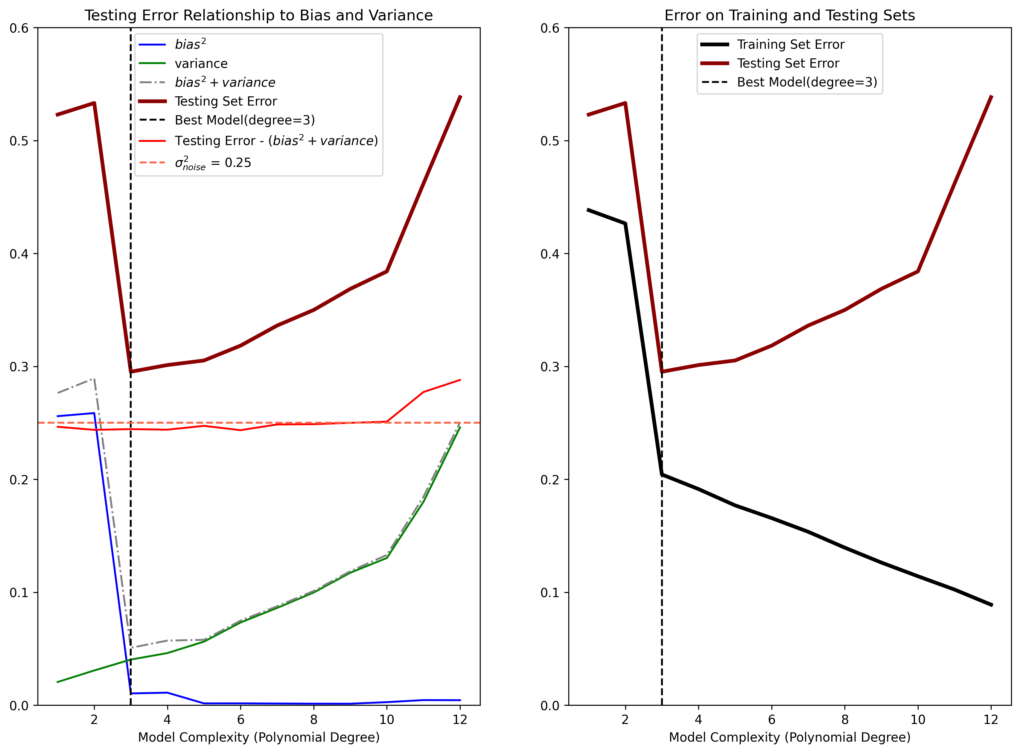
Figure 4: (Left) Demonstration of how estimator bias and variance contribute to the mean squared error on the Testing Set. The Testing Set error (dark red) can be broken down into a three components: the squared bias (blue) of the estimator, the estimator variance (green), and the noise variance \(\sigma_{noise}^2\) (red). The “best” model (polynomial degree \(D=3\)) has the optimal balance of low bias and low variance. Note that the noise variance is considered a lower bound on the Testing Set error, as it cannot be accounted for by any model. (Right) Demonstration of overfitting when the model complexity suprasses the optimal bias-variance tradeoff. Models with a complexity above \(D=3\) are able to fit the Training Set data better, but at the expense of not generalizing to the Testing Set, resulting in increasing generalization error.
Python Code
np.random.seed(124)
n_observations_per_dataset = 25
n_datasets = 100
max_poly_degree = 12  # Maximum model complexity
model_poly_degrees = range(1, max_poly_degree + 1)

NOISE_STD = .5
percent_train = .8
n_train = int(np.ceil(n_observations_per_dataset * percent_train))

# Create training/testing inputs
x = np.linspace(-1, 1, n_observations_per_dataset)
x = np.random.permutation(x)
x_train = x[:n_train]
x_test = x[n_train:]

# logging variables
theta_hat = defaultdict(list)

pred_train = defaultdict(list)
pred_test = defaultdict(list)

train_errors = defaultdict(list)
test_errors = defaultdict(list)

# Loop over datasets
for dataset in range(n_datasets):

    # Simulate training/testing targets
    y_train = f(x_train) + NOISE_STD * np.random.randn(*x_train.shape)
    y_test = f(x_test) + NOISE_STD * np.random.randn(*x_test.shape)

    # Loop over model complexities
    for degree in model_poly_degrees:
        # Train model
        tmp_theta_hat = polyfit(x_train, y_train, degree)

        # Make predictions on train set
        tmp_pred_train = polyval(tmp_theta_hat, x_train)
        pred_train[degree].append(tmp_pred_train)

        # Test predictions
        tmp_pred_test = polyval(tmp_theta_hat, x_test)
        pred_test[degree].append(tmp_pred_test)

        # Mean Squared Error for train and test sets
        train_errors[degree].append(np.mean(error_function(tmp_pred_train, y_train)))
        test_errors[degree].append(np.mean(error_function(tmp_pred_test, y_test)))


def calculate_estimator_bias_squared(pred_test):
    pred_test = np.array(pred_test)
    average_model_prediction = pred_test.mean(0)  # E[g(x)]

    # (E[g(x)] - f(x))^2, averaged across all trials
    return np.mean((average_model_prediction - f(x_test)) ** 2)


def calculate_estimator_variance(pred_test):
    pred_test = np.array(pred_test)
    average_model_prediction = pred_test.mean(0)  # E[g(x)]

    # (g(x) - E[g(x)])^2, averaged across all trials
    return np.mean((pred_test - average_model_prediction) ** 2)


complexity_train_error = []
complexity_test_error = []
bias_squared = []
variance = []
for degree in model_poly_degrees:
    complexity_train_error.append(np.mean(train_errors[degree]))
    complexity_test_error.append(np.mean(test_errors[degree]))
    bias_squared.append(calculate_estimator_bias_squared(pred_test[degree]))
    variance.append(calculate_estimator_variance(pred_test[degree]))

best_model_degree = model_poly_degrees[np.argmin(complexity_test_error)]


# Visualizations
fig, axs = plt.subplots(1, 2, figsize=(14, 10))

## Plot Bias^2 + variance
plt.sca(axs[0])
plt.plot(model_poly_degrees, bias_squared, color='blue', label='$bias^2$')
plt.plot(model_poly_degrees, variance, color='green', label='variance')
plt.plot(model_poly_degrees, np.array(bias_squared) + np.array(variance),  linestyle='-.', color='gray', label='$bias^2 + variance$')
plt.plot(model_poly_degrees, complexity_test_error, label='Testing Set Error', linewidth=3, color=ERROR_COLOR)
plt.axvline(best_model_degree, linestyle='--', color='black', label=f'Best Model(degree={best_model_degree})')
plt.plot(model_poly_degrees, np.array(complexity_test_error) - (np.array(bias_squared) + np.array(variance)), color='red', label='Testing Error - ($bias^2 + variance$)')
plt.axhline(NOISE_STD **2, color='tomato', linestyle='--', label=f'$\sigma_^2$ = {round(NOISE_STD**2, 3)}')

plt.xlabel('Model Complexity (Polynomial Degree)')
plt.ylim([0, .6]);
plt.legend()
plt.title('Testing Error Relationship to Bias and Variance')

## Plot Train / Test Set Error
plt.sca(axs[1])
plt.plot(model_poly_degrees, complexity_train_error, label='Training Set Error', linewidth=3, color=DATA_COLOR)
plt.plot(model_poly_degrees, complexity_test_error, label='Testing Set Error', linewidth=3, color=ERROR_COLOR)
plt.axvline(best_model_degree, linestyle='--', color='black', label=f'Best Model(degree={best_model_degree})')
plt.ylim([0, .6]);
plt.xlabel('Model Complexity (Polynomial Degree)')
plt.title('Error on Training and Testing Sets')
plt.legend(loc='upper center')
In the left subpanel of Figure 4 we see how, as the model complexity increases, the estimator variance (green curve) also increases. Additionally, as model complexity increases, the squared bias (blue curve) decreases. Thus there is a tradeoff between bias and variance that comes with model complexity:
- models that are too complex will have high variance and low bias
- models that are too simple will have high bias and low variance.
- The best model will have both low bias and low variance.
In this example, we highlight the best estimator in terms of prediction error on the testing set (dark red curve) with a dashed black vertical line. The best estimator corresponds to a polynomial model of order of \(D=3\). Notice that the vertical black line is located where function defined by the sum of the squared bias and variance (dashed gray curve) is also at a minimum.
It’s also important to notice that the sum of the squared bias and variance has the same shape as the curve defined by the mean squared prediction error on the testing set. This exemplifies how the error on novel data can be used as a proxy for determining the best estimator from a candidate set based on squared bias and variance. The noise term in Equation 6 is also represented in the left subpanel of Figure 4 as the red curve. This curve was calculated by taking the difference between the Testing Set error and the sum of the variance and squared bias. We can see that the noise term is roughly constant, and equivalent to underlyng the variance of the observations \(\sigma_{\text{noise}}^2\) (indicated by the dashed red line).
Testing Set Error versus Training Set & Overfitting
It’s important to be clear that all of the simulated results above are based on evaluating prediction error on novel data, not used to estimate model parameters. It turns out that assessing a model performance based on prediction error calculated on the same data used to estimate the model parameters is highly problematic, as it causes models to always “overfit.” In plain terms, overfitting means that we will always favor a more complex estimator if we assess goodness of model fits on the training data, as a more complex model will be better able to capture small, random trends in the data due to noise.
This overfitting phenomenon is demonstrated in the right side of Figure 4. For the same simulation data as in the left of Figure 4, we plot the error calculated on the Training set (black curve) along with the error calculated on the testing set (red curve). We also identify the best estimator based on the Testing Set Error.
We see here that as model complexity increases, the error calculated on the training set continues to decrease, whereas the error on the testing set increases past the optimal polynomial order \(D=3\). We showed above that error calculated on the testing set is the true indicator of how well an estimator will generalize to new data points. The error calculated on the training set strongly disagrees with the error calculated on the testing set after the optimal model complexity has been reached. Since, in general, the whole point of modeling a data set is to generalize to novel data, assessing model predictions on the training set data should be avoided.
Wrapping Up
In this post we discussed how the bias and variance of an estimator are related to squared prediction error on the testing set. Though we focused on regression, these concepts can also be applied to classification problems. We found that an optimal estimator will have both low variance and low bias. We further found that information about squared bias and variance is contained in expected prediction error calculated on a testing set of data not used to fit a model’s parameters.
The concepts of estimator bias and variance are generally only clear in the context of an ensemble of datasets. However, in real-world applications, there is generally only a single observed dataset. In such cases the roles of bias and variance are less obvious (though, it is possible to calculate estimates of variance and bias using resampling methods such as bootstrapping).
However, the direct connection we made between bias, variance with the mean-squared error calculated on a testing set give us a direct means for assessing a group of candidate estimators in light of a single data set. We only need to partition the available data set into a Training Set used to fit model parameters and a Testing Set used to assess prediction accuracy.
Comparing prediction accuracy across potential estimators is equivalent to assessing biases and variances of the estimators across many datasets. Note that resampling methods such as cross-validation can prove helpful here, particularly when the amount of observed data is small.
Notes
This post is a refactor of content with the same title originally posted on The Clever Machine Wordpress blog.